Leading the creation of a design system

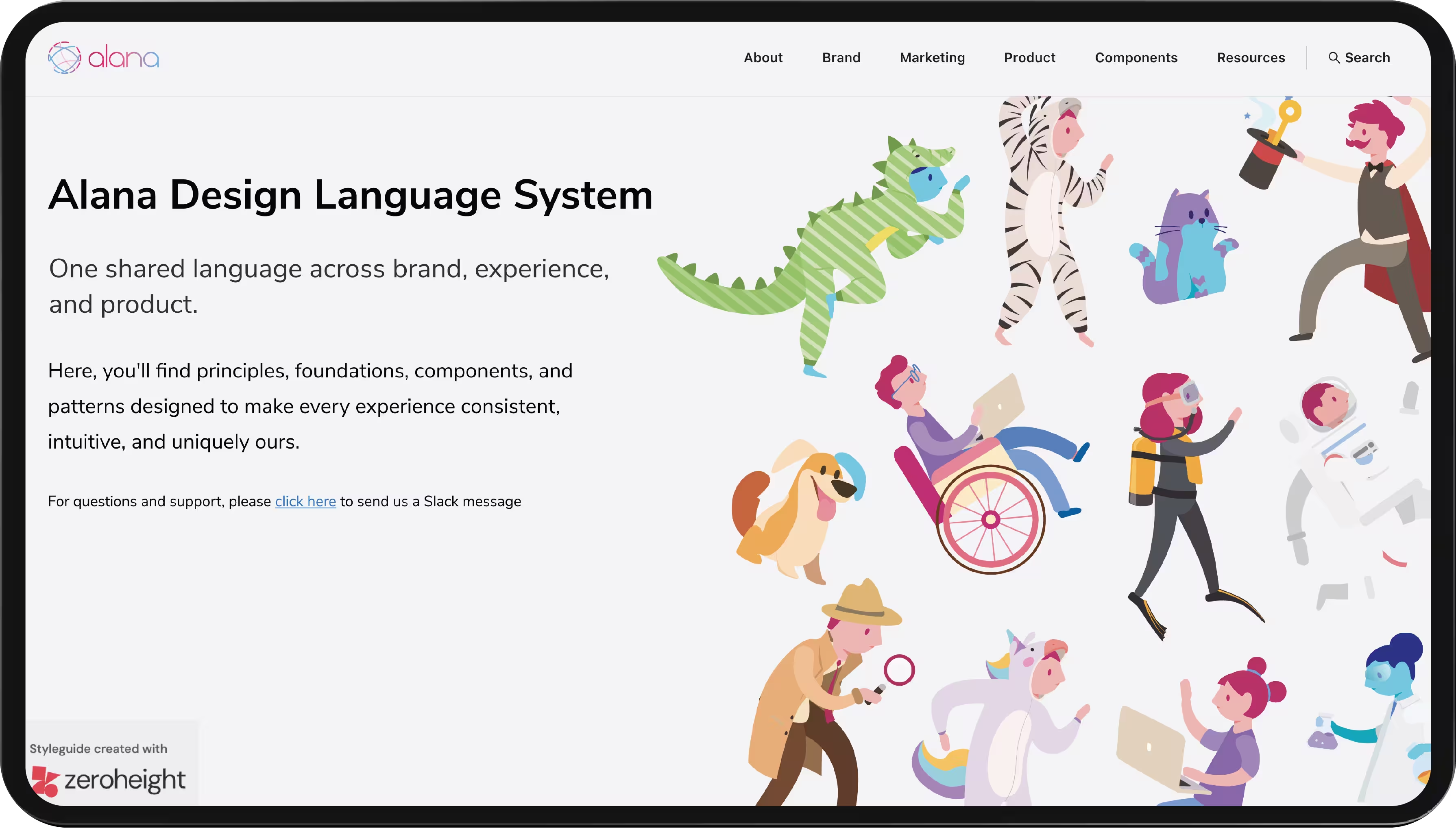
Alana Design Language System overview
Timeline 
12 weeks
(Jun–Sep 2020)
Role          
Hands-on
design lead
Team          
2 designers,
2 engineers

Turning a startup’s brand into a system the team could build with

Alana AI had a logo, a pile of generic stock image photos, and no design system, right as it started building its SaaS platform. I led the creation of a system that gave the product one language, made it feel human in a market that looked cold and interchangeable, and, by the team’s sprint estimates, cut design time by around 40% and development time by around 20%.

Impact

A design language system that cut the time to design and build new features, and gave the whole company one source of truth: a tone of voice for marketing, a clear experience for sales to promise, and a consistent product for engineering to build.

−xx%
Time to design
−xx%
Time to develop
+xx%
Brand awareness & market differentiation
Exact figures are Alana-internal. Happy to walk through them in an interview.
The problem

Alana AI is a customer service AI scale-up built on a proprietary NLP engine, unusually strong in Portuguese and Spanish. It had mission and values on paper, but in practice the brand was a logo and stock images that looked like every other AI company of the moment. There was no design system at all. At the same time, the company started building its SaaS platform, and high turnover plus a complex product were stretching design and development time.

Without a single source of truth, work kept restarting. New people rebuilt what already existed, patterns drifted, and every drifting pattern cost time to reconcile. The team did not need prettier screens. It needed one language it could build with, quickly, and keep consistent as it grew.

The deeper problem

People were wary of AI

When this work began, AI was not the everyday tool it is now. Many people either doubted it worked at all, or were afraid of it, worried it would take their jobs, or worse. Most companies in the space fed that unease without meaning to, reaching for the same stock imagery of holograms, glowing circuits, and cold, hyper-advanced machines. The whole category ended up feeling distant and a little threatening.

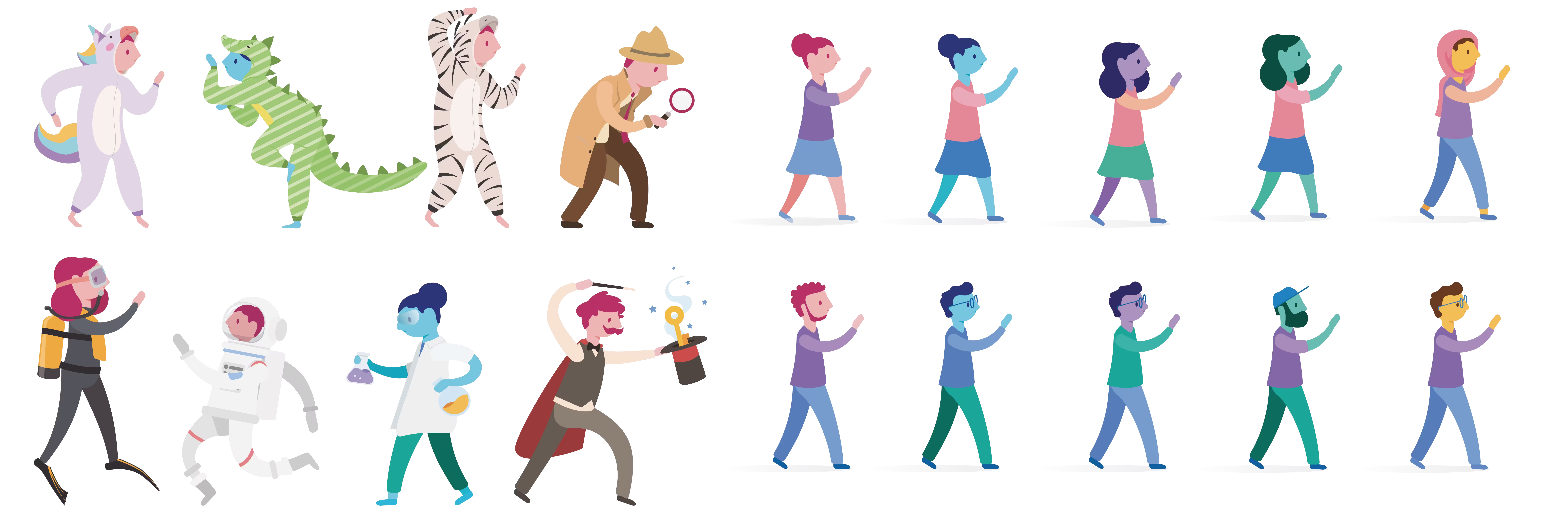
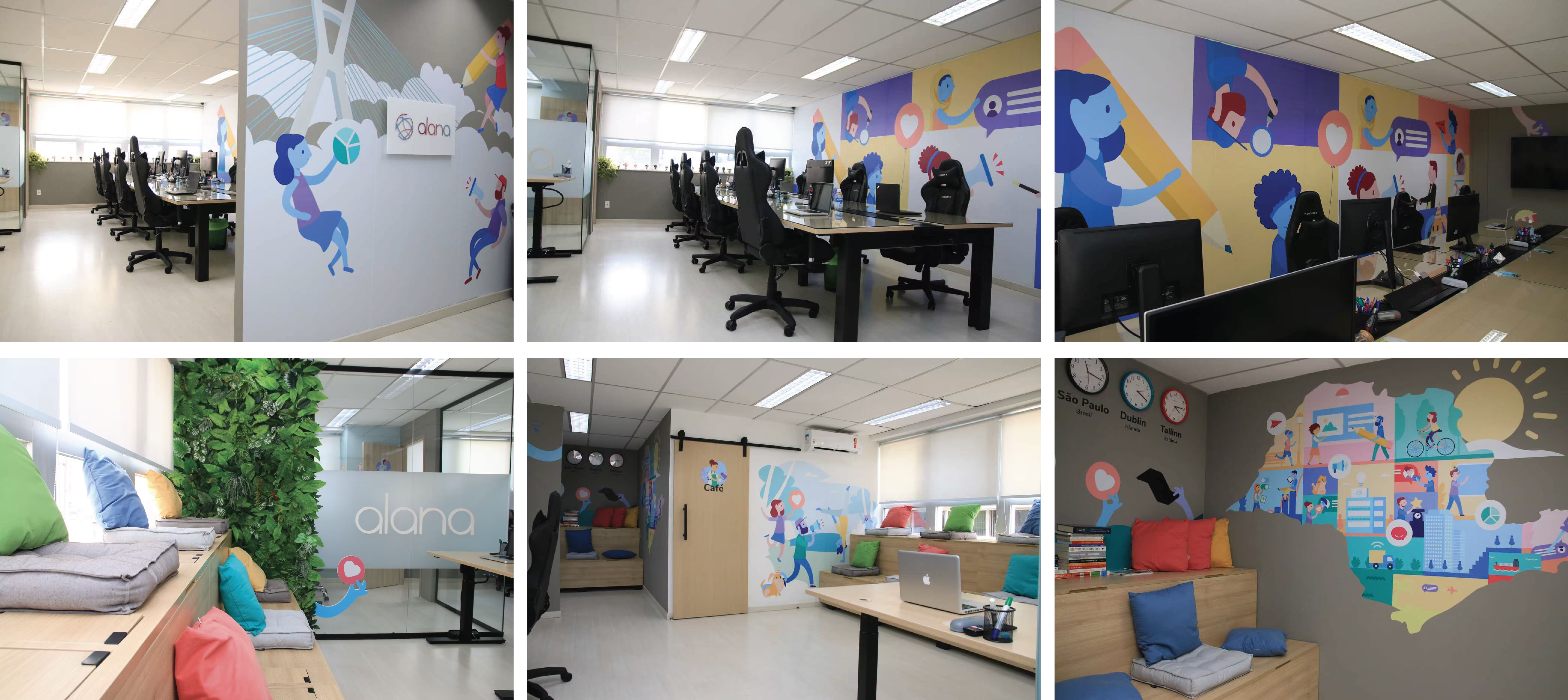
I treated that perception as the real design problem, not a branding footnote. So I pushed the brand and the system hard in the opposite direction: friendly, colorful, and human. Illustrations with people at the center, a bright and approachable palette, calm and rounded components, and inclusive characters across different skin tones. The goal was for Alana to feel like a helpful colleague rather than a machine to fear. This turned into a real competitive edge. While the rest of the segment looked interchangeable, this product was recognizable on sight, and that distinct look and feel carried from the marketing into the product itself.

Friendly, inclusive illustrations at the center of the brandThe brand carried into the product and the physical space
What I did

I led the creation of a design system with every core component, grounded in a brand we built from the company’s own principles, tested for accessibility, and treated as a product with two internal customers: the designers and the engineers who used it every day.

The part I care about most is that the system went past how the product looked. It also set how the product should behave and how it should speak.

I grounded the system in the brand

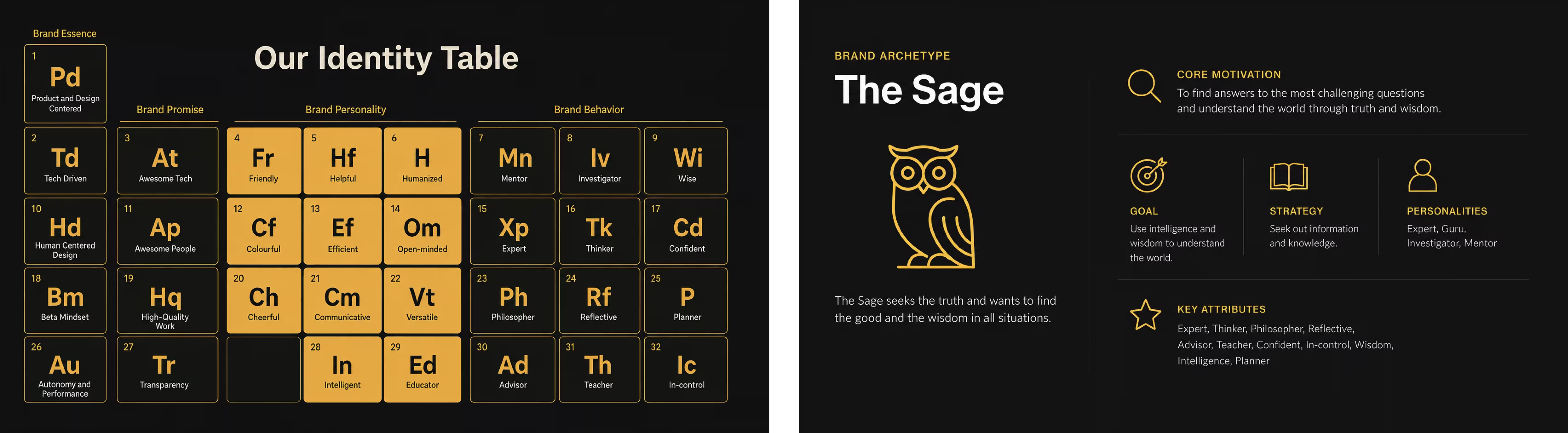
Before drawing a single component, I ran the brand through a structured framework to define what the product should promise, sound like, and do. An archetype exercise landed on the Sage, a brand that guides and teaches, which fit a company whose entire value was making complex AI understandable. Paired with the friendly, human direction, it gave Alana a rare combination: the authority of an expert and the warmth of a colleague. From there, every later decision had a reason, from tone of voice to the shape of a button.

BIRA framework, brand archetype (the Sage), and the identity table

I used atomic design as the system’s architecture

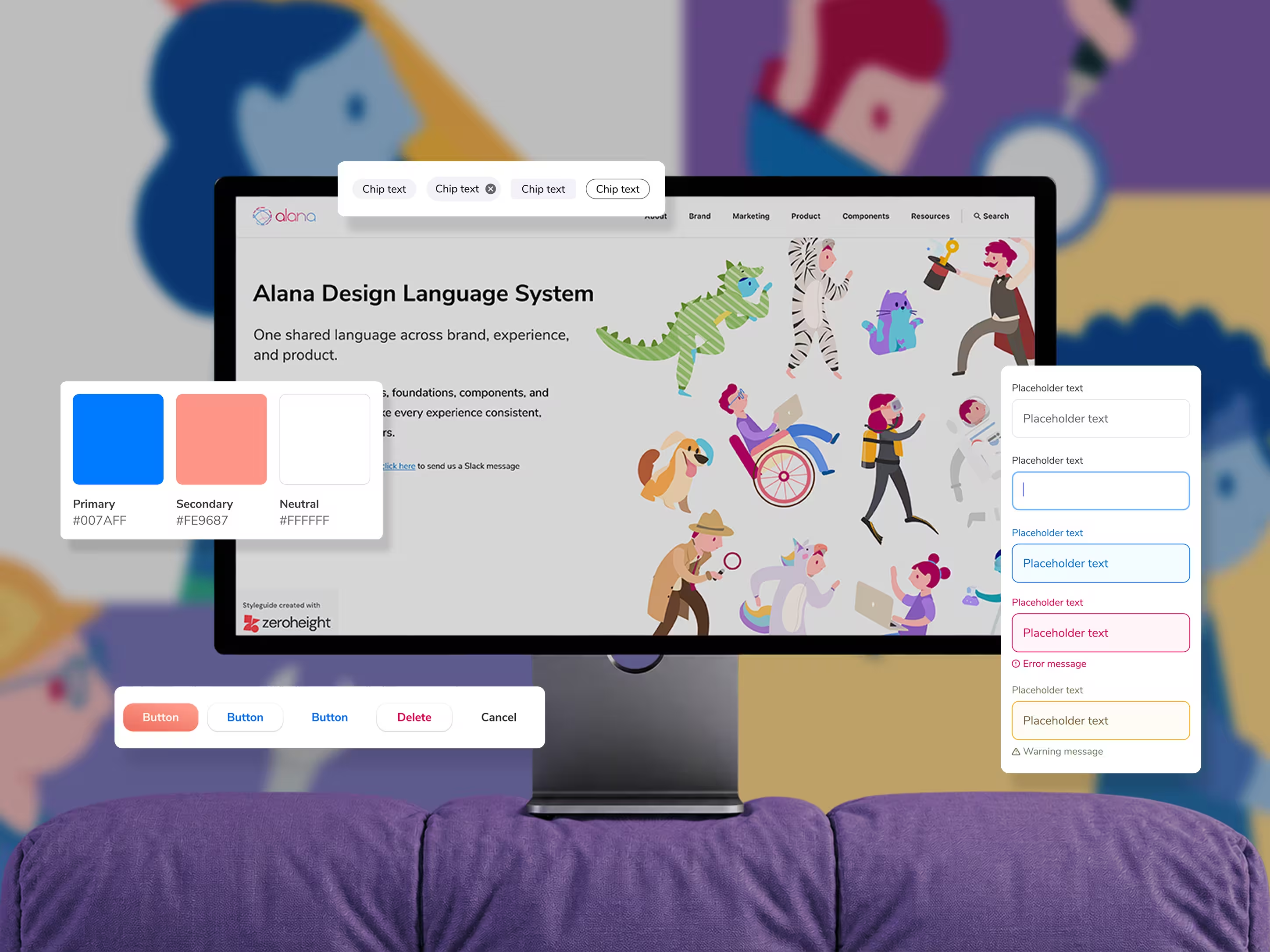
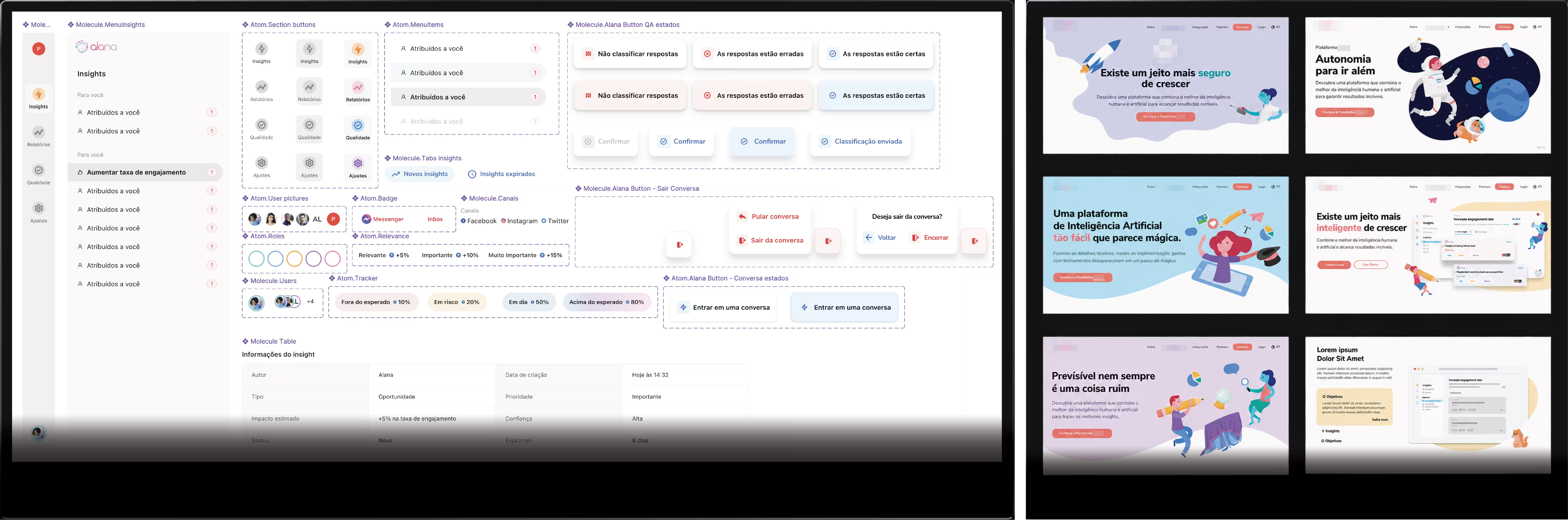
I structured the system the way atomic design structures matter: values and personality as the atom, brand pillars as the molecule, and the outcomes people see as the organism. In product terms that became tokens, components, and patterns that combine predictably and scale across surfaces. One source of truth, documented in Zeroheight, so the team could find and reuse it instead of rebuilding it every sprint.

Atom / molecule / organism structure and the component library

I let research decide behavior

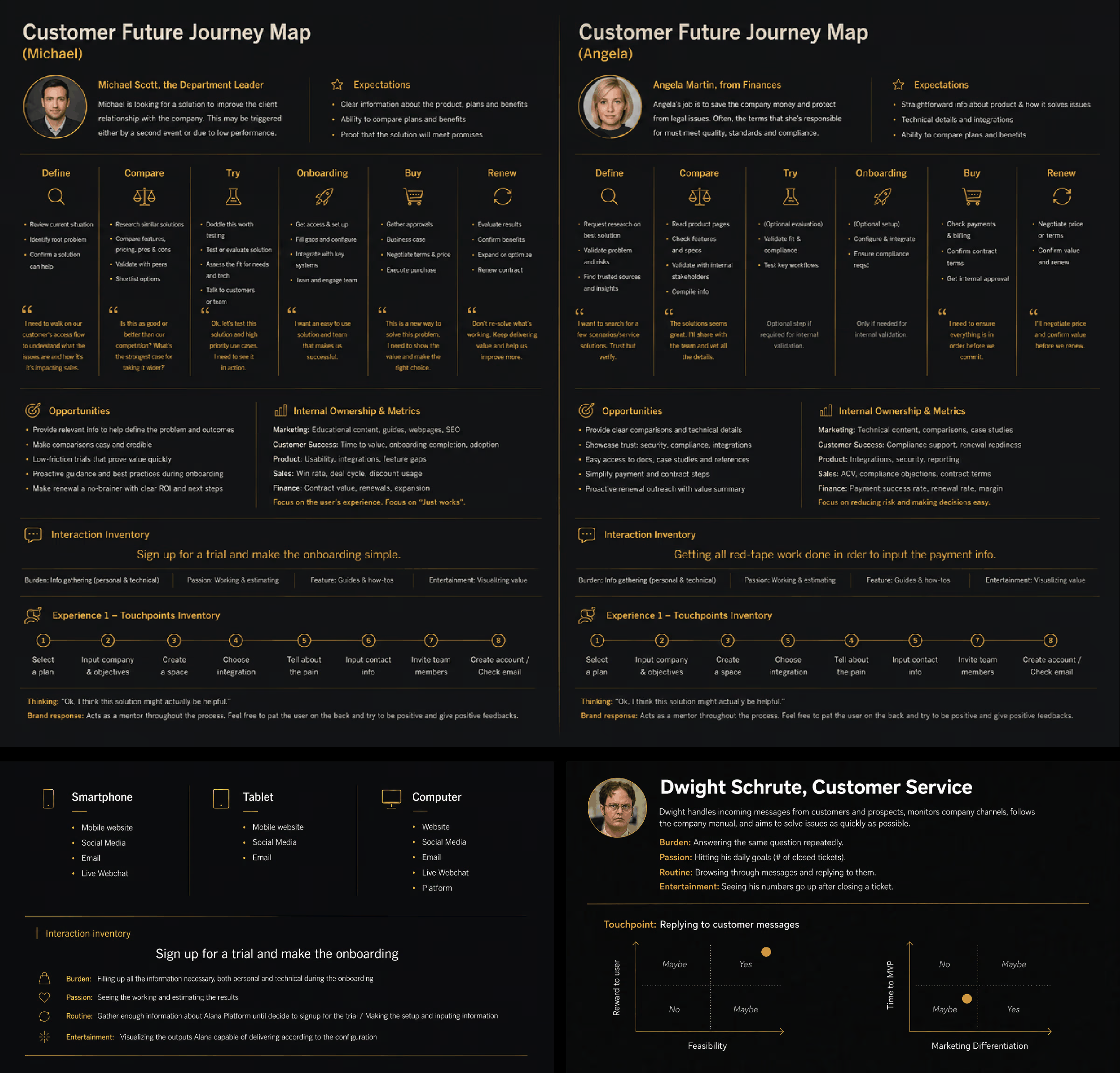
Personas, journey maps, and a touchpoint inventory showed where and how people met the product across web and mobile. Behavioral data from Hotjar and Fullstory backed that up. A simple risk-and-reward matrix helped us prioritize what to build first, weighing user reward against feasibility and time-to-MVP against differentiation. Decisions came from evidence rather than taste.

Personas, journey maps, and risk-and-reward matrices

The system encoded behavior and voice

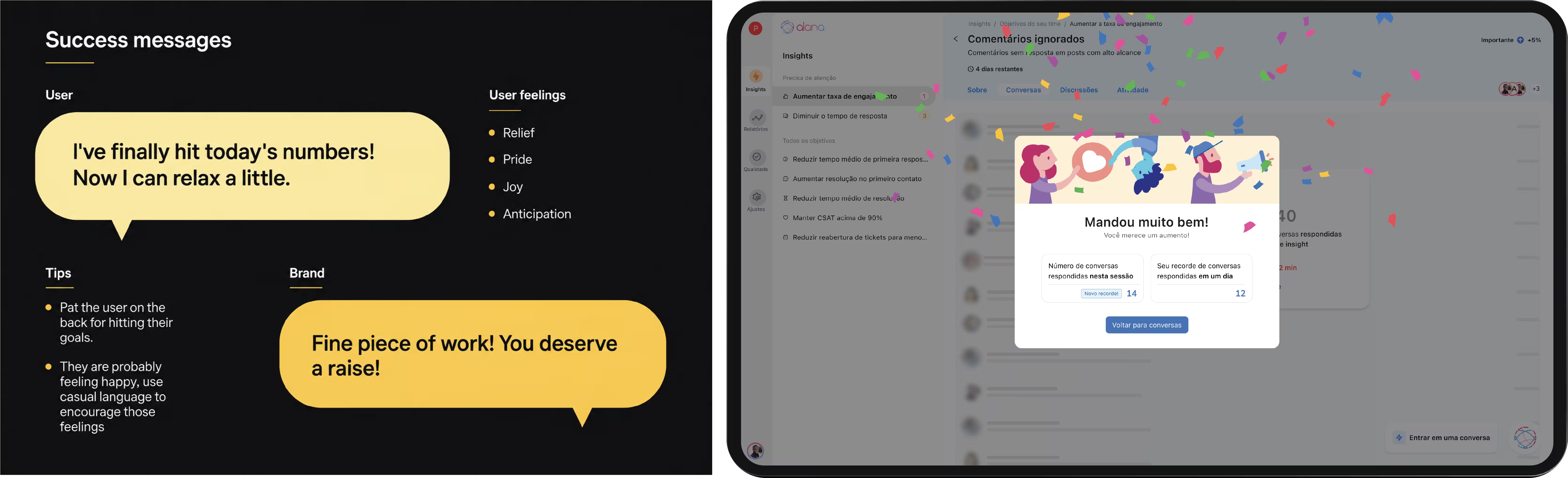
This is the part most design systems miss. Because the brand was built into the system, it could tell the product how to respond, not only how to appear. When an operator hit their daily goal, the interface answered in the brand’s voice, warm and encouraging, tuned to what the person was likely feeling in that moment. Making a brand behave consistently everywhere is far harder than making it look consistent, and that is what the system did.

Success message example and the brand voice in the product UI

I treated accessibility as a contract

The system carried its own accessibility guarantees, so product teams did not have to rediscover them on every screen. I validated components with keyboard navigation, a screen reader, and contrast checks, and built inclusive color and clear states in from the start. The rule was simple: the component guarantees the basics, keyboard operability, focus, contrast, readable states, and the product team stays responsible for the parts only context can decide, like meaningful labels and reading order on a specific page. That split let a small team keep quality high without re-auditing everything by hand.

I built it to be adopted and implemented

I worked in Agile next to engineering so the components matched the React they were building, which kept the system honest through implementation. I documented everything in Zeroheight so a new hire, and with the turnover there were many, could find the source of truth instead of guessing. And I partnered with marketing and content so the language stayed consistent outside the product too.

Zeroheight documentation and component specs
The tradeoff I made

With 12 weeks and a team of four, I could not standardize everything without freezing the product, and I could not leave everything open without recreating the chaos we started from. So I locked the pieces that appeared on almost every screen, the core inputs, buttons, states, and the brand’s voice patterns, and left composition deliberately flexible. It meant a few one-off layouts stayed inconsistent for a while. It also meant the parts people touched a hundred times a day were solid, which is where the speed came from. Given the constraints, I would make the same call again.

Leading the work

As Head of Product Design, I led the design on this project with another designer and two engineers, ran the research and the workshops, and kept design, product, and engineering aligned while the system and the platform were built in parallel. The system’s job was to let a small team move like a bigger one, and it did.

Keeping the system alive

A design system has to outlive the people who made it. Here that was not abstract. Turnover was high and new designers and engineers kept arriving, so I treated the system as a living product with two internal customers, not a file I handed off and forgot.

Documentation carried most of that weight. Zeroheight was the single source of truth, and I kept it current as the product grew, so someone joining on a Monday could find a component, its states, and the reasoning behind it without asking around. Under constant turnover, good documentation was the difference between the system compounding and the system rotting.

Governance stayed light because the team was small, so it came down to a clear owner and a clear bar. I stewarded what went in: a new pattern earned its place by showing up more than once and fitting the brand and accessibility rules already set, and anything that stopped working got deprecated instead of left to linger. Keeping the design files and the React implementation in sync, sprint by sprint, stopped the documented system and the shipped product from drifting apart.

Over time the system grew with the company. As new surfaces and needs appeared, I extended the same foundation instead of starting new islands, and revisited earlier decisions when reality proved them wrong. The goal was never a finished library. It was a system that stayed useful, consistent, and cheap to build on while the product and the team kept changing around it.

Learnings

Research earned its place. Every persona and journey map kept us honest about who we were designing for. The tradeoff taught me the rest: a system for a small team wins by being strict where it matters and loose everywhere else. And the strongest ideas came from working closely with people outside design, the engineers, marketers, and content folks whose perspectives made the system better than a design team could have made it alone.

Next

Making anyone a Copilot agent builder

LinkedIn